Context
I needed a liability insurance certificate. At Luko by Allianz Direct, obtaining this document requires navigating into the contract, finding the right accordion, understanding a certificate type selection, then generating. The interface does not understand why the user is there. When someone opens their insurance client area, they want two things: access their documents or file a claim. Everything else is noise.
I reached out to someone on the inside, a Luko alumnus. He confirmed what the interface hinted at: after the acquisition, the team had shifted a lot, and product decisions were hard to push through.
Audit
The My Account space does not know what it is. It wavers between a management tool and an acquisition channel. In product management, this is a positioning problem: when a product tries to serve two contradictory jobs-to-be-done, it fails at both.
On trust: the chat switches to English when the site crashes. Loading times are visible on nearly empty pages. When you refresh you get a 503 that does not recover, with the page in raw text, cookie banner included. In UX, perceived performance is a signal of reliability. When the interface is slow or unstable, the user projects that fragility onto the service itself.
On hierarchy: documents are scattered across three locations. Home blocks are written like marketing pages. The newsletter prompt is more visible than the contracts access. The Allianz Travel banner appears even inside the certificate form. The user's mental model ("I manage my insurance") does not match the information architecture presented ("here are our offers").
Prototype
Based on this audit, I opened a session with Claude. The tool navigated the app, explored the flows and formalized the audit. The site went down with a 503 during the exploration.
Guiding principle: the client area serves the two reasons why a policyholder logs in. Get a document, or file a claim. Everything that does not serve these two goals is removed. This is a standard product prioritization exercise: identify the critical paths and eliminate the noise that dilutes them.
Three rounds of iteration, each guided by a different design principle.
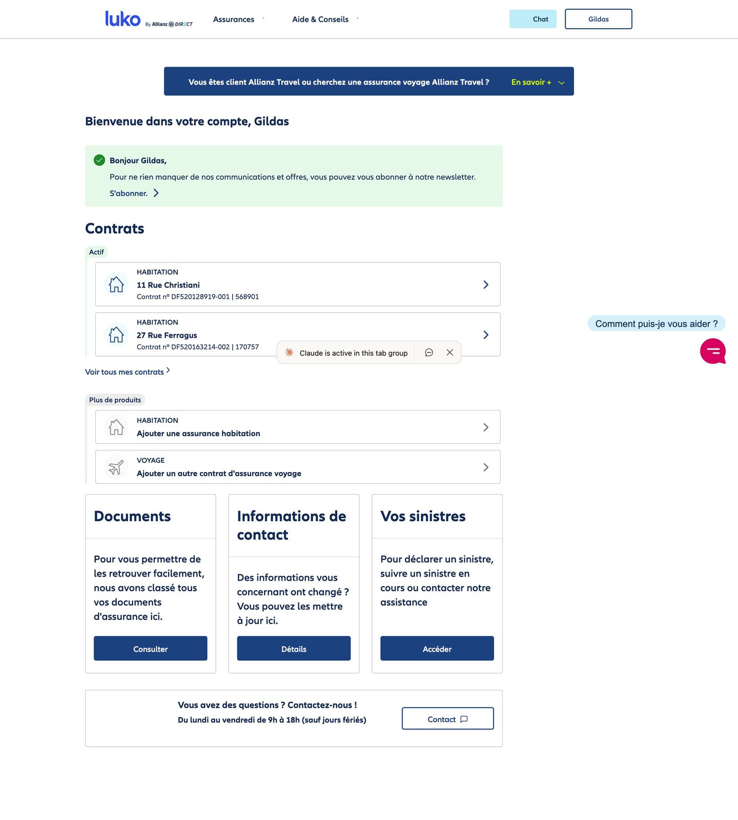
Progressive disclosure: the claims declaration starts from the home with property selection. The user first sees their contracts, then accesses the actions in context. No more navigating inside a contract to find a buried funnel.
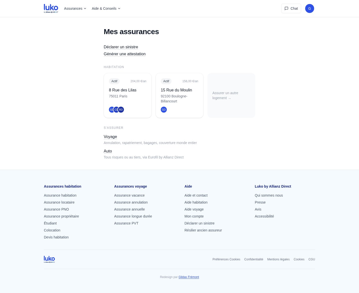
Wording as UI: the framing "add a contract" becomes "get insured." The first describes a system action, the second describes the user's intent. The actual catalog (home, travel, auto via Eurofil) replaces a generic button that promises nothing.
Proximity principle: the Documents tab disappears. Documents belong to the context of each contract, not to a separate silo. The profile is under the avatar, not in a tab. Navigation goes from three tabs to zero: everything is accessible from the home because everything is in the right place.
The flows
The prototype does not stop at the home. Two critical flows were rebuilt end to end, because that is where the current interface loses the most time and trust.
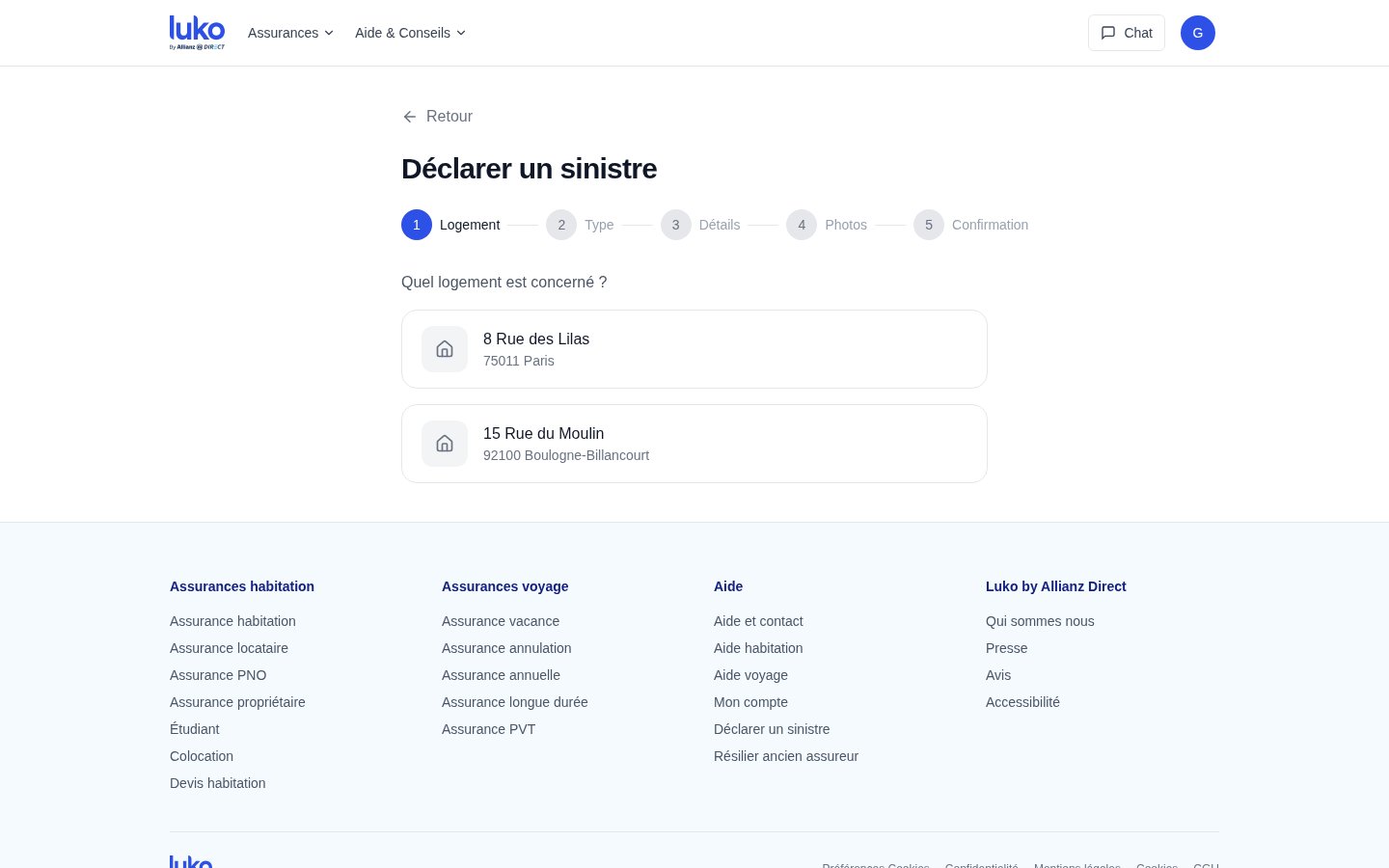
The claims declaration now starts from the home in one click. The user selects the property concerned, then a five-step wizard (property, type, details, photos, confirmation) guides them without ever sending them back to a contract or an accordion. In the current interface, filing a claim requires first finding the right contract, then navigating its submenus -- a flow that assumes the user thinks in terms of contract numbers, not in terms of a problem to solve.

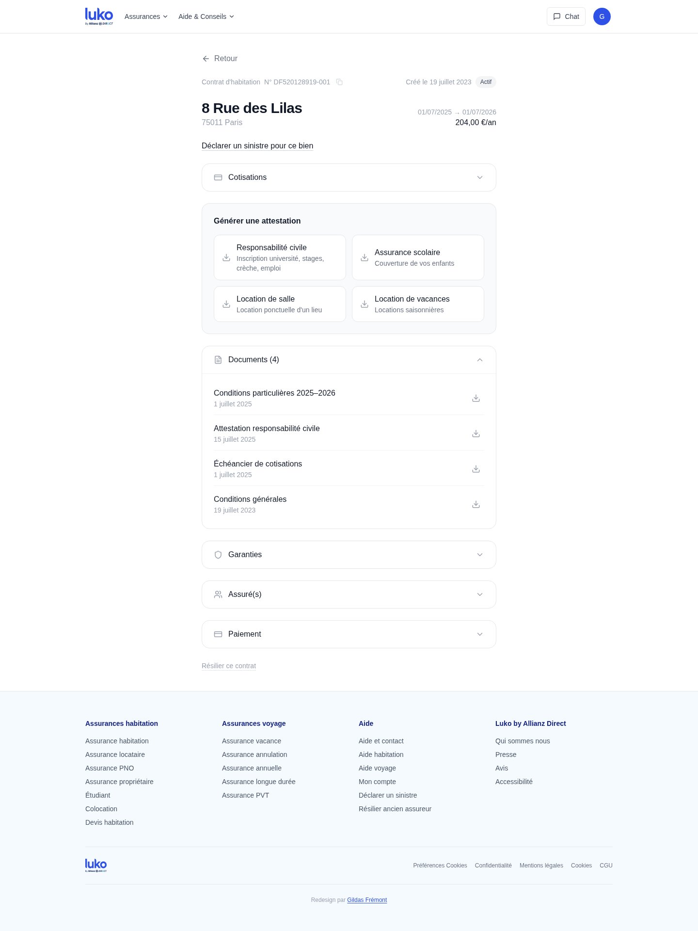
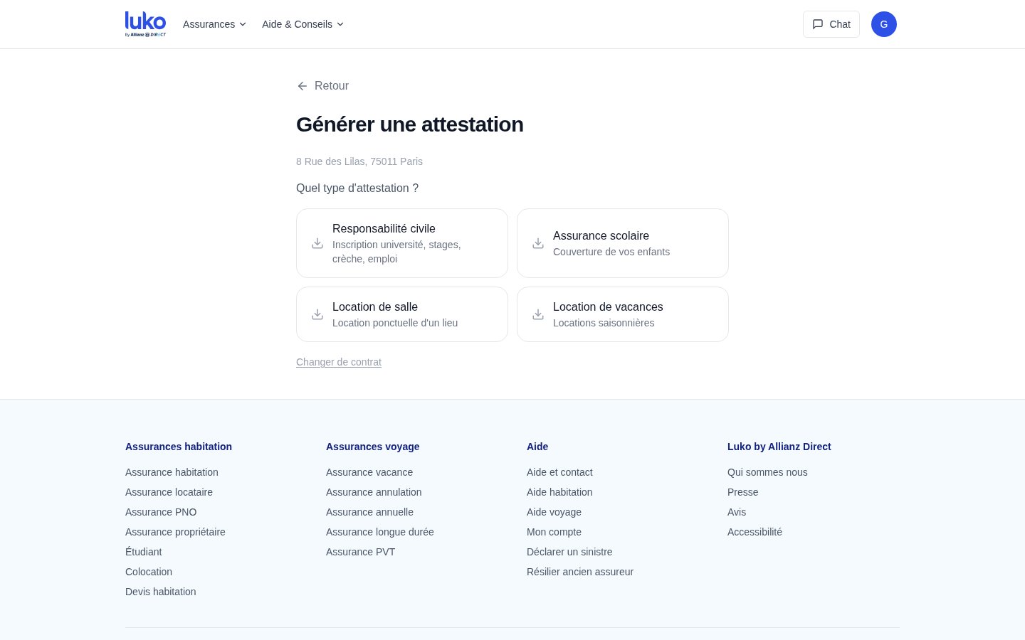
Certificate generation follows the same logic. From the home, the user clicks, selects the contract, then immediately sees the four available certificate types (liability, school insurance, venue rental, vacation rental) with their use case indicated as a subtitle. One click generates the PDF. In the current interface, this same flow requires five interactions and an accordion.

The contract view
Each contract has its own page. At the top, the address, status, dates, annual price. Below, the claims declaration contextualized to that property. Then the certificates available for that specific contract -- not in a separate Documents tab, but where the user looks for them. Documents (specific terms, payment schedule, general terms) are grouped under the contract they belong to, with their date. The Guarantees, Insured party(ies) and Payment accordions complete the page without cluttering the default view.
The principle is co-location: each piece of information lives in the context that gives it meaning. The original scatters these elements between the home, a Documents tab and contract sub-pages. The redesign gathers them in a single hierarchical location.