Ornikar
Zero to one
Getting 15,000 people through 96 prefectures
First product manager, employee nº 8 · 2014–2016 · B2C marketplace on a regulated market
Lucca: salary review
Feature
Twenty candidate views, three that remain
Fractional product director · since 2023 · New product on a suite of 13 modules and 7,800 customers
Lucca: impersonation
Pattern
One mechanism that constrains naming, navigation and permissions
Fractional product director · since 2023 · Design system and cross-cutting patterns
Lucca: admin roles
Consulting
A permission model that spilled over into the admin experience
Product design, framing, functional modelling · 2025, target usage 2026 · With Product, Customer Success and the roles task force
UBAQ
Consulting
An audit that found the organisation behind the interface
Product audit, then ongoing support · NTU platform, healthcare compliance
Guinet-Derriaz 1912
Software
An information system for a group that had none
Information system from scratch · 2022, one year at two days a week · €100k budget
Synaxe
Consulting
A sensor product that was a compliance product
Fractional CPO · 2023–2024, six months · DUNE suite, quarries, concrete and asphalt plants
monbanquet.fr
Software
A bespoke quote in thirty minutes
Head of product · 2017–2019 · Online caterer built on independent artisans
Luko by Allianz Direct
PrototypeAn unsolicited redesign, with the screens
Side project · March 2026 · Insurance customer area · Built with Claude in a few hours
The journey
Designer first, then product, then code, then running product, then twenty-seven engagements
Employee nº 10, first UX designer, 2011–2014Create the design function of an HR software company and rework the early modules so they hold together as one suite. Bring the onboarding of a new customer from three days of implementation to forty-five minutes. Start several of the products that became the Lucca suite.
Employee nº 8, first product manager, 2014–2016Move from design to product on a market with no platform and no legal framework. The case is above.
 Full stack developer bootcamp, batch 30
Learn to build what I had been specifying.
Head of product, 2017–2019Run product for the first time, on a company whose survival depended on one tool. The case is above.
 Head of product, 2019–2020
Rebuild the acquisition funnels and the CMS of a broadband comparison site with 1.2 million visitors a month on a monolith, while helping move the organisation to a product model. The information architecture is still the one in use.
Product direction on demand for software companies and startups: audits, design systems, product creation, simplification of complex flows, information systems, product-led growth. Lucca, UBAQ, Guinet-Derriaz and Synaxe are the cases above.
Education
- Le Wagon, full stack developer bootcamp, batch 30
- Strate, Paris, industrial and interaction design
- Grenoble École de Management, innovation management
- Saint-Jean de Douai, CPGE
Writing
- The bias of software, March 2026
- An unsolicited redesign of Luko by Allianz Direct, March 2026
- Inside a product audit, June 2025
- Impersonation, anatomy of a pattern, March 2025
- Compliance is not a feature, November 2024
- All articles →
Ornikar
Zero to one
Getting 15,000 people through 96 prefectures
First product manager, employee nº 8 · 2014–2016 · B2C marketplace on a regulated market
Ornikar sold the driving licence without a driving school, at a time when the law did not allow it yet. Learners sat the exam as independent candidates, which meant registering with one of ninety-six prefectures, each with its own forms and habits. Everyone read the situation as an acquisition problem. I read it as a registration problem and put the product effort there, against the prevailing view. We started by registering learners by hand to learn the rules, automated them once they were stable, then I stripped the learner journey down. Eighteen months later, Ornikar had 15,000 paying users.
The context
In 2014, Ornikar is a few months old, has eight employees and is already in court. The driving school unions sue the company in April for illegal practice and lose in June, while the commission that grants the driving school licence turns it down at every request. The licence only comes in March 2016, after the Macron law. Throughout that period, an Ornikar learner studies the highway code online, takes lessons with an independent instructor and sits the exam as an independent candidate, which means being registered with the prefecture of their département, which assigns them a candidate number and then an exam slot.
I joined as the first product manager, reporting to the two founders. I was handed the product team to build, the learner and instructor journeys, the support team to create and the exam registration chain end to end.
The real problem
A startup that has just raised comes with an implicit brief, the acquisition curve, except that the problem I could see in the tickets was elsewhere. A learner who has paid and cannot get registered for the exam asks for a refund, opens a ticket and leaves a bad review. Every cohort brought some, each one more expensive than a learner never acquired.
Registration was hard for two reasons. The rules were written nowhere we could read them, since each of the ninety-six prefectures had its own forms, deadlines and reading of the texts, which lived in counter practice rather than in documents. The population, for its part, was everyone who takes a driving test, which forbade me to assume anything about the learner, neither their equipment, nor their ease with written administrative French, nor the validity of their papers.
The constraints
A team of eight, no legal framework since the licence was refused and the lawsuits ongoing, which ruled out any solution going through driving school status, ninety-six administrations to make work without any leverage over them, under the eye of investors who expected a growth curve rather than a support team.
The options and what I chose
| What I chose | The credible alternative | |
|---|---|---|
| The bet | Put the product effort on the registration journey, until a learner who pays is registered for the exam without our help. | Spend on acquisition to fill the funnel while leaving registration to support, as a manual process. |
| Why | On a regulated market, friction is the leading indicator and growth follows with a lag. Every cohort acquired on a broken journey made the problem worse. | Faster to show a curve and easier to tell investors, at the price of refunds on every cohort and a support team the marketplace was not supposed to have. |
| The cost | Less legible growth for several months, plus a support team to hire and pay, which I had to defend in front of the founders and the investors. |
What I did, in order
- Register by hand first. I built an internal support team that registered learners one département at a time. The point was less to handle the load than to learn rules that only existed in counter practice.
- Automate each département once its rules were stable. When support had no surprises left on a département, I had what it had learned encoded. Automating earlier would have encoded assumptions.
- Then strip the learner journey down. Forms, documents, messages, redesigned without assuming anything about the person on the other side. Every step removed on the learner side was a step support had first done by hand.
- Build both teams. I hired and led the product team from the first hire, as well as support, which I treated as the product's learning organ rather than a cost centre.
The order mattered, because each phase produced the knowledge the next one needed.
The registration journey, before and after
- Pays
- Emails their documents
- Support checks, département by département
- Manual registration at the prefecture
- Weeks of back and forth
- Pays
- Guided form, documents checked on entry
- Rules encoded per département
- Registered without our help
What came out of it
Everything described here shipped and ran in production. In eighteen months, Ornikar went from zero to 15,000 paying users, with a registration chain that grew with the cohorts instead of against them and a support load the marketplace could carry. Refunds for failed registration stopped being a cohort issue. In 2015, Ornikar received the Trophée de design stratégique in the service design category. The company then obtained its licence, passed a million registered learners and raised $145 million between 2018 and 2021, on the registration foundation built during those two years.
What I took from it
Every screen I designed while assuming something about the learner, a computer rather than a phone, an easy read of administrative French, papers in order, broke on the first hundred users. That is how I learned the rule that then decided the order of the three phases: until a rule had been checked on real files, it did not go into the product.
- Technical expertise
- Encoding the rules of ninety-six prefectures, document capture and validation, a registration chain built to keep up with the cohorts.
- Management
- Product team built and led from the first hire, support team created and staffed, a prioritisation defended against the acquisition reflex in front of the founders and the investors.
- Ecosystem
- Candidates, independent instructors, prefectures, the founders and their investors, not to mention driving school unions suing the company.
Method and references
Doing things by hand before automating them is the oldest startup advice there is, Paul Graham's "Do things that don't scale" (2013). Here the manual phase served less to handle the load than to read rules written nowhere. Prioritising by friction removed rather than by acquisition follows from the market: on a regulated product, an acquired user who fails costs more than a user never acquired. The learning rule that set the order of the phases, a hypothesis is only worth something once it has met real files, is the one I later described in Speed and Vision Go Very Well Together.
Lucca: salary review
Feature
Twenty candidate views, three that remain
Fractional product director · since 2023 · New module on a suite of 13 modules and 7,800 customers
Lucca wanted a salary review module, the yearly campaign where managers propose raises within a budget and HR consolidates and decides. When I picked the topic up, twenty candidate views had piled up, each requested by a real customer for a real reason. I kept three, one per moment of the campaign, and sent the rest to filters and exports. The module shipped in September 2024 in Pagga Rémunération. A sound mental model clarifies every step, from the manager who proposes to the salesperson who presents, which is why this three-view version ended up as the demo.
The context
Lucca is an HR software company with thirteen modules and more than 7,800 customers, sharing the employee record, the permission model and the approval chain. A new module inherits the constraints of the other twelve, just as a design decision made in one travels to all of them. I have worked there since 2023 as a fractional product director, directly with the lead of each business suite. On this module I worked with the lead of the business suite, the designer and the engineers of the team. I owned the product definition and the decision of what ships.
What a salary review is
Once a year, sometimes twice, a company decides who gets a raise and how much. Managers propose for their team within a budget, HR and finance consolidate and check the proposals against the budget, the compensation policy and fairness, an approval chain closes the campaign and payroll applies the outcome. Every company runs it a little differently, by budget or by hierarchy, by grade or by site, in one round or several. Before the module, most ran it in spreadsheets sent around by email.
The real problem
By the time design started, twenty candidate views had piled up, none of them wrong. A view per manager, a view per budget, a view for the arbitration meeting, a view for the person who checks the totals: each made sense to the customer who had asked for it and, built on its own, would have made a reasonable feature. Every request was legitimate. The question was rather what a manager can learn in a single campaign and what an HR person needs to read at a glance when the proposals come in.
The options and what I chose
| What I chose | The credible alternatives | |
|---|---|---|
| The bet | Keep three views, one per moment of the campaign, leaving the rest to a filter, an export or a module that already exists. | Ship all twenty behind a configuration layer. Or rank the requests by number of customers and ship the top of the list. |
| Why | A campaign has few moments: the manager proposes within their budget, HR tracks the proposals against the budget, someone approves and hands over to payroll. One view per moment is what a manager retains in one campaign. | Configuration moves the decision to a customer who has less context than we do, then gets paid for three times: at build, at rollout, in use. Ranking by requests rewards the loudest customer and produces the same sprawl, later. |
| The cost | Seventeen requests without a dedicated screen, to be explained one by one to the customers who had made them, with the risk that a frequent campaign case would not fit the three views. |
What I did
- Map the campaign as it is run. Not as each customer described it, but the moments where someone needs a screen to act.
- Sort the twenty requests by the moment they serve. The popularity of a request says who spoke loudest, whereas the moment says what the campaign needs. Sorted by moment, the twenty requests almost all fitted into three views.
- Hold the scope. Every view kept is a view to learn, to maintain and to multiply by every future change, which had me carry that refusal to the suite lead at every new good reason to widen.
The campaign and where the views sit
- The manager proposes, within a budget
- HR and finance consolidate against the budget
- Arbitration
- Approval and handover to payroll
One view per moment that needs one, the rest as a filter or an export.
What came out of it
The salary review campaign module shipped in Pagga Rémunération on 16 September 2024, wired into the suite's employee record, permission model and approval chain, with the export to payroll. The Office international de l'eau writes on Lucca's site that its first campaign saved it two days of meetings with the management line and a day of data consolidation. The module also became the sales demo, without that being the goal, because a model that makes sense in one campaign also makes sense in a fifteen-minute meeting. You build a product so that it sells, but you do not design its core for the demo.
What I took from it
Creating a product on a mature suite is mostly subtraction, which is harder to defend than addition because every view removed has a customer behind it. I held because I had replaced the question "who asked for it" with "at which moment of the campaign does it serve", which brings every request back to the need it expresses.
- Tools
- Figma, the Lucca design system.
- Technical expertise
- A module wired into the shared employee record, the permission model and the approval chain, with no local object.
- Management
- Arbitrating customer requests with the suite lead, holding a scope against twenty good reasons to widen it.
- Ecosystem
- Customers' HR teams and managers, the design system team, the other twelve modules and the sales team that took the module up for demos.
Method and references
Designing for the process as it is run rather than as each customer describes it is the Jobs to be done reading of customer requests, where the request describes a solution and the job the moment someone needs to act. Three views rather than twenty configurable ones is also the stance Lucca takes on each of its modules: the product fixes the how, meaning the structure of the campaign, while the customer configures the what, their budgets and their rules. I developed this trade-off in The Bias of Software.
Lucca: impersonation
Pattern
One mechanism that constrains naming, navigation and permissions
Fractional product director · since 2023 · Design system and cross-cutting patterns
In HR software, an employee's view routinely has to be opened by someone else: a manager who approves, an assistant who enters the leave of an absent director, an administrator looking for a setting. Most software answers with a separate admin screen, then maintains two representations of the same data that drift apart. Lucca had chosen the other path from its first products, impersonation, but the knowledge had evaporated as the teams grew. Rather than let each new team rediscover or bypass the rule, I traced its origin and named what it imposes on the rest of the software, before writing it down as a pattern.
The mechanism, in one minute
To impersonate is to take on someone's identity. The word took its technical meaning in the 1990s with Windows NT: a system process that had to act with a user's rights borrowed their security context for a moment without becoming that user. The idea underneath is a temporary, traceable delegation. Lucca carried it from infrastructure to interface. An employee selector in the main view: the manager picks a member of her team, the screen becomes the employee's, with their data and their context, while every action is logged in the manager's name. Technically it is a dropdown and a context switch, for a single view to maintain.
The real problem
When I took over the cross-cutting patterns of the design system in 2023, the teams were using the word without its consequences. Impersonation had structured the first generation of products, the ones I had worked on in 2011, but nobody carried the rule any more. The symptom was admin screens reappearing module by module, each reasonable on its own. The extra screen costs nothing on day one. It costs later, in two ways. The first is the maintenance load: two representations of the same object have display rules, forms and edge cases that get fixed twice, or once without anyone knowing which, so that every change to the product is paid on each of them. The second, the more expensive one, is conceptual debt: multiplying views and nominal cases spares everyone the question of coherence. Nobody decides what the object is, what it is called and who can see it, since each screen has its local answer, until the question comes back later, on software that has grown on top of it.
What impersonation imposes on the rest of the software
The mechanism is not complicated. What the teams had lost sight of is everything it imposes on the rest of the software. If an employee's main view can be opened by someone else, it can no longer be called "My leave" or "My schedule", the possessive stops working the moment a manager looks at it for a member of her team. You need names that describe the resource or the operation, "Requests", "Schedule", "Account", and the naming comes out clearer for everyone. The menu can no longer be organised as employee view, manager view, admin view, since impersonation erases that boundary: it follows the steps of the business process, with permissions deciding what is visible. Finally, the author of an action becomes distinct from the owner of the data: when an assistant enters leave for an executive, the absence belongs to the executive and the entry is attributed to the assistant. It sounds obvious once said, yet software without impersonation rarely models it.
| Impersonation in the main view | A separate view per role | |
|---|---|---|
| The cost | Every view has to bear being looked at by someone else: neutral names, navigation by workflow, author and owner modelled separately. | One more screen and one more menu entry, which costs nothing on day one. |
| What you get | One representation of each object. The manager sees exactly what the employee sees, so support, training and bug reports talk about the same screen. | Two representations that drift apart, a maintenance load that doubles and a coherence question nobody has to ask any more. |
The options and what I chose
| What I chose | The credible alternatives | |
|---|---|---|
| The bet | Write the rule as a pattern, in Christopher Alexander's sense: context, problem, forces, solution, consequences. A document product managers read before a screen exists. | A design system component. Or a functional spec describing the employee selector. Or write nothing and fix module by module. |
| Why | The rule fits neither in a component nor in a spec: it is an architecture principle decided at design time, long before Figma. What had to be passed on were the forces, so that people who were not there could settle the cases I had not foreseen. | A component freezes the mechanism and lets the consequences go. A spec describes a screen. Fixing module by module is paid on every module without stopping the next one from making the same mistake. |
| The cost | Engagement time spent on a document with no visible deliverable, to be defended as product work, for a text that protects nothing until it is read. |
What I did
- Trace the mechanism back to its origin. To Windows NT and to the first Lucca products where it had been the rule.
- Name what it imposes. The three consequences above, with concrete examples taken from the existing modules.
- Write it down and circulate it. The pattern in the design system as the product managers' shared reference, the article for the outside.
One view, two people
- Logged in as herself
- Picks an employee
- Sees the employee's view: Requests, Schedule, Account
- Acts, the action is logged in her name, for him
No separate admin screen to build, to name or to keep in sync.
What came out of it
Designed and circulated: the pattern is in the design system, where the product managers of the suites have it as a reference, and the article came out in March 2025. A pattern is judged over years, by the number of admin screens that do not get built.
What I took from it
Every piece of software holds design choices that do not look like features and that shape every feature to come. Identifying them and writing them down is probably the most profitable design work on a mature product, but also the one done least, because it produces nothing visible and requires understanding the software as a whole. I had to defend that time as product work, and I would do it again.
- Tools
- Writing. The pattern document and the article.
- Technical expertise
- Security context switching, attribution in the audit trail, permission model and their consequences on information architecture.
- Management
- Passing an architecture principle on to teams growing faster than institutional memory.
- Ecosystem
- Lucca's product teams and design system, then any B2B or B2E software where several roles work on the same data.
Method and references
Christopher Alexander's pattern form, A Pattern Language (1977), used for what it is for: making explicit the forces behind a recurring solution, so that people who were not there can apply it. The full text is in Impersonation: anatomy of a pattern. Impersonation is also an example of what I call the bias of software: an architecture decision taken once for all modules, which removes a choice from the next teams instead of leaving it to them.
Lucca: admin roles
Consulting
A permission model that spilled over into the admin experience
Product design, framing, functional modelling · 2025, target usage 2026 · With Product, Customer Success and the roles task force
Lucca's permission model could represent almost any HR access rule, a flexibility that spilled over into the admin experience: an administrator had to rebuild the model in their head to configure it. The natural brief was to simplify the roles screen. I proposed something else: keep the engine, change the mental model and the journeys. A primary role for an employee's normal function, complementary accesses for the exceptions and friction proportional to risk on sensitive permissions. It is a vision and a doctrine written in 2025 with a Product and Customer Success task force, for use in 2026.
The context
In HR software, access to a piece of information is not a boolean. The same operation can be allowed on oneself, on the people one supervises, on a department, on several legal entities or on the whole company, the effective permission being the combination of what a user can do and whom they can do it on. Lucca's model covered all of it, from the simple case, "a manager sees their team", to multi-application, multi-entity, temporary or sensitive configurations. Customer administrators configure it, Customer Success consultants deploy it, security officers answer for it. I worked on the topic in 2025 with Product, Customer Success and a roles task force. I held the framing, the functional modelling and the target usage architecture. The roles guide that came out of it was written by three of us.
The real problem
The Customer Success memo described the irritants moment by moment, which had me look for the problem in a customer's lifecycle rather than in the screen. At instance creation, you need a doctrine and there was none. When adding an application, you would have to fold its permissions into the existing roles, an operation tedious enough that people created a single-application secondary role per user instead, so that every application sold added configuration debt: that was the cost of cross-selling. When replacing an employee or when a works council member arrives, you need an exception object, yet the only one available looked like a normal role. At audit time, finally, the most frequent question, "why does this person see this data", cost more to answer than the configuration had cost to make, because the answer had to be rebuilt from several roles and the logs could be read neither by user nor by role.
Two things framed the work. A permission's label described an action, not everything it opened access to, so that a permission could look right for a business need and expose personal data. A signal from Customer Success gave the target: in roughly nine cases out of ten they observed, a user would have needed a single multi-application role, which was enough to design the nominal path around a single role.
The constraints
We had to keep the whole functional range, because advanced customers cover real complex cases, touch the data model as little as possible so that migration stays affordable across thousands of production instances, not confuse simplifying with removing exceptions, which exist in the reality of companies, prevent security mistakes without making ordinary operations painful, all within a doctrine that consultants and customer administrators can apply, not only the product team.
The options and what I chose
| What I chose | The credible alternatives | |
|---|---|---|
| The bet | Keep the technical objects, clarify what each one is for, add a structuring attribute, criticality, then rebuild the journeys around the majority case. | Simplify the roles screen, which was the brief. Or a rebuild from scratch: new taxonomy, security groups, policies, an attribute-based engine. |
| Why | A cleaner screen on the same model reduces visual load and leaves the structural risk intact, whereas the historical model carried real business value, which made the best simplification go through an asymmetry of use and guardrails rather than through fewer objects. | The rebuild is cleaner on paper and moves the problem to migration, compatibility and transformation cost. |
| The cost | A project harder to sell than a new screen, because it changes a doctrine rather than an interface, with a legacy to own: historical configurations whose criticality is unknown and which we had to accept leaving as "unknown" rather than deciding arbitrarily. |
What I did
- Reframe the problem. From "simplify the roles screen" to "change the mental model", starting from the five moments in the lifecycle where the model hurt.
- Model the objects. The primary role becomes an employee's normal function: permissions do not define the role, the function defines the permissions needed. Secondary roles become complementary accesses, reserved for temporary, exceptional or small-population situations. All managers share a Manager role, with those who handle expense reports receiving an extra access rather than a "Manager with expenses" role.
- Introduce criticality. Reading ordinary data about one's team, reading personal data, handling management data and changing the instance configuration do not carry the same risk, so the interface changes its behaviour with it instead of hoping the administrator remembers.
- Design the guardrails, on every path. Management permissions do not go into a non-critical role, bulk addition to a critical role is blocked or limited, a CSV import goes through the same validations as the equivalent action in the interface, otherwise the screen is safe and the system is not.
- Sequence the deployment of an application. Temporary accesses for installation and testing, customer validation, merge into the primary roles at go-live, clean-up.
- Turn the investigation around. An entitlements view that starts from a person and traces back to the sources of their rights, logs readable by user, role, permission and change, a diagnostic that flags users without access, large exposed populations and near-redundant roles.
| Criticality | What it covers | Behaviour |
|---|---|---|
| Default | The ordinary permissions of everyday use. | Added in one step. |
| Supervision | Non-sensitive data about one's team. | Added in one step. |
| Sensitive | Personal or sensitive data. | Friction in a non-critical role. |
| Management | Management data with real consequences. | Critical roles only. |
| System configuration | Actions that change how the instance works. | Friction even in a critical role. |
Installing a new application
- Install
- Find every role the new permissions belong to
- Or create a secondary role per user
- Configuration debt for good
- Install with temporary accesses
- Configure and test
- The customer validates permissions and populations
- Go-live: merge into the primary roles
- Clean-up
What came out of it
The result is a proposal: the target usage architecture, the roles guide written with the task force as a shared doctrine between Product, Customer Success and customers, the wireframes of the friction journeys and of the entitlements view, the migration strategy. It is a 2025 vision with target usage in 2026. The measures that will track the direction are defined: the share of users with a single primary role, the number of complementary accesses per user, the time and errors to open a newcomer's accesses, the temporary accesses still present a few days after a go-live, the time to answer "why does this user have this right". Two points remained open at the end of my engagement: the discovery of the diagnostic module and the exact handling of roles whose criticality cannot be inferred.
What I took from it
When a historical model carries business value, the best simplification is not always having fewer objects. Here it was an asymmetry, a normal base and a layer of exceptions, with guardrails that follow the effect of an action rather than the screen it comes through. The other thing I keep is the "unknown criticality" class: less comfortable than an automatic classification, but the only one that does not make the system lie about historical configurations.
- Tools
- Wireframes of the friction journeys, the roles guide written with the task force.
- Technical expertise
- Authorisation model: operations, scopes, permissions, roles, entitlements, a criticality attribute, validations on import, logs readable along several axes.
- Management
- A task force between Product and Customer Success, a doctrine written to be applied by consultants and customer administrators.
- Ecosystem
- Customer administrators, Customer Success, security officers, thirteen modules and the regulatory weight of HR data.
Method and references
Security through interaction rather than through documentation: instead of hoping the administrator remembers that a permission is dangerous, the interface changes its behaviour with the risk. The rest is domain modelling, kept close to the existing engine to keep migration cost low. At bottom, a permission model that can represent anything is software without an opinion. The complexity of the domain does not disappear, it is moved onto the administrator as configuration. The primary role and the complementary accesses are a way of taking it back on ourselves, the trade-off I describe in The Bias of Software.
UBAQ
Consulting
An audit that found the organisation behind the interface
Product audit, then ongoing support · NTU platform, healthcare compliance
UBAQ publishes NTU, the platform that declares links of interest between pharmaceutical companies and healthcare professionals. The team could feel the interface working against it and had seen several fixes fail to hold. The brief fitted in one sentence: understand what is wrong and say what to do. I chose five internal interviews and a review of the application, with no user testing and no analytics. The interface flaws were the symptoms of a company without product expertise, a roadmap driven by migrations and quick fixes that fed the next ones. I recommended on three registers, interface, skills and process, so that repainting would not be the only way out.
The context
UBAQ sells regulatory compliance software to the healthcare industry. NTU handles the transparency of links of interest between pharmaceutical companies and healthcare professionals, under the French law regulating benefits. Compliance software is bought because the law requires it and kept if the people who use it every day find their work in it, which gave the interface its weight. Customers were in the middle of migrating from the previous product, one churn risk at a time, onto an interface that made their lives harder. There was no UX profile in the company and the product team lived in firefighting mode. The audit was commissioned through Grandwork. I did the method, the interviews, the diagnosis and the recommendations on my own, then the correction mock-ups and the revised roadmap with the team.
The choice of evidence
The first decision of an audit is what you look at. The reflex would be to propose user tests and ask for analytics, which I did not do.
| What I chose | What I set aside | |
|---|---|---|
| Evidence | Five internal interviews with different profiles and my own review of the application in staging. | Tests with end users, analytics, heatmaps. |
| Why | Interviews cross what people believe the tool does with the constraints its builders were working under, a gap where the blind spots live. | On a niche B2B product with few active users, the quantitative signal is mostly noise, while tests would have confirmed symptoms the team already saw. |
| The cost | A diagnosis resting on five people and my own eye, with no number to hold up against a disagreement, on a deliberately narrow scope that leaves aside business decisions and functional coverage to look only at why what exists behaves badly. |
First level: what the interface showed
The clearest example is an object the system calls "manifestation". To the model it is one thing. To the sales people who use it, it is three, events, donations and contracts, behind which they think in spend and in customers. The technical model was simplified at the expense of the mental model of those who use it every day, what Don Norman calls the gulf of evaluation. The rest of the list is of the same kind: a kanban with no drag and drop and non-linear steps, a table in disguise promising a flow it does not show, a menu whose entries changed with the state of a business object, forms mixing four kinds of information and two business flows on a single screen, dense out of a refusal to choose.
Second level: why it held
Each of these points could have been fixed on its own. The useful question was why the kanban was in that state when the team knew it was failing. The interviews traced back to the mechanisms. Every customer request became a feature with no question of value: the team received solutions to build, never problems to solve, which is the simplest test to tell an IT organisation from a product organisation. The roadmap was driven by the migration of customers off the old solution, churn managed one case at a time, sacrificing tomorrow's customers to today's retention. Without UX or product expertise in the room, every feature landed where it was cheapest to build. The mechanism feeds itself, since every quick fix adds complexity, complexity raises the pressure and pressure pushes towards quicker fixes.
What I recommended
An audit that stops at the interface produces a list of corrections, useful and fragile: if the conditions that produced the problems persist, they come back in other forms within months. So I recommended on three registers while making explicit that they are not independent, so that the sponsor could choose knowingly how deep to intervene.
| Register | What it changes | Why not on its own |
|---|---|---|
| Interface | Objects that match business concepts. A view built for the real flow instead of the kanban. Stable navigation. Ungrouped forms. | Repainting a wall whose foundations are moving: the same causes rebuild the same interface. |
| Skills | UX and product expertise, hired, borrowed or grown. | Better diagnosis of problems nobody has time to address. |
| Process | A prioritisation framework, a way out of reactive mode, protected time for coherence. | A framework nobody has time to apply stays a document. |
What users think in and what the system showed them
- Spend
- Customers
- Events, donations, contracts, kept apart
- One object: "manifestation"
- Three concepts merged
- A kanban with no flow
- A menu that changes with the data
What came out of it
I delivered the two-level diagnosis, the recommendations on three registers, then the correction mock-ups and a revised roadmap. The navigation redesign started on these recommendations and the engagement carried on into execution with the product team. What followed showed that the organisational diagnosis was the most useful lever: the team could arbitrate differently because it had words to name what was stuck beyond the interface.
What I took from it
An interface problem that has survived several fixes is an organisation problem, which is a delicate thing to tell a sponsor who commissioned an interface diagnosis. Five interviews are enough when you run them as an inquiry into mechanisms rather than as a wish list.
- Tools
- Interviews, review of the application in staging, mock-ups.
- Technical expertise
- Domain model against mental model, navigation architecture, reading a kanban that is a table in disguise.
- Management
- Getting a team out of reactive mode: a prioritisation framework, protected time for coherence, the organisational diagnosis said out loud.
- Ecosystem
- Healthcare compliance, pharmaceutical companies, the French law regulating benefits, the product team of a niche B2B software company.
Method and references
Don Norman's gulf of evaluation, The Design of Everyday Things, for the first level. For the second, looking for the causes of the causes before deciding what to do with the interface. The full reasoning is in Anatomy of a product audit. Two other texts give the background. Compliance Is Not a Feature describes what makes regulatory software bought for the law and kept for the use. You Don't Need a Product Manager is about the difference between a team that receives solutions and a team that receives problems.
Guinet-Derriaz 1912
Software
An information system for a group that had none
Information system from scratch · 2022, one year at two days a week · €100k budget
An industrial marble group, fourteen quarries, around ten million euros in revenue, sales in several countries, but no information system. Orders lived in individual spreadsheets and nobody could say what was in stock, in which quarry, under which name. I was asked for tools for the sales team and for operations. I started with the product catalogue, because the name a customer orders under and the name production uses had nothing in common, and nothing downstream could be automated before that was settled. Then I chose vendors rather than building. After one year at two days a week and a hundred thousand euros, the group was quoting, tracking and delivering from a shared master data set.
The context
Guinet-Derriaz has been extracting and working stone since 1912. In 2022, the group has fourteen quarries, customers abroad and runs on files kept per team: the sales team quotes on one version of the catalogue, operations work on another, so that no question spanning two teams has a single answer. I reported to the group's management, as the only product profile, with the sales team, operations and the quarries as counterparts. I had the whole information system, from the catalogue to the tools, within an envelope of a hundred thousand euros and two days a week for a year.
The real problem
I was asked for tools, one for the sales team, one for the quarries, quickly. The problem I found underneath is that a block of marble changes name between the moment a customer orders it and the moment production handles it, and that four versions of the catalogue were in circulation. A tool built on those four versions would have failed at the first disagreement between two teams, which would have sent everyone back to their spreadsheets. As long as the catalogue was not settled, neither stock, nor quotes, nor deliveries could be automated.
The options and what I chose
| What I chose | The credible alternatives | |
|---|---|---|
| The order | The catalogue first, the database next, the tools last. | Start with the tools requested while normalising the catalogue along the way. |
| Build or buy | Choose vendors for the sales and operations tools, sitting on the master data. | Build custom, which at that budget would have produced a tool and a half. |
| The irregular | Run on Excel and Airtable the processes still too irregular to automate, until their rules were clear enough to encode. | Force them into a tool right away, encoding rules nobody knew yet. |
| The cost | The tools people were waiting for came last, after months spent on a catalogue nobody had asked for, an order I had to hold in front of teams who wanted to see something. |
What I did, in order
- Formalise the product catalogue. A description of every product that the sales team, operations and the quarries agree on, with the mapping between the commercial name and the production name.
- Build the shared database. The least visible piece and the one everything depends on, delivered before anyone saw a tool.
- Select the tools rather than build them. For sales and for operations, sitting on the same data.
- Leave the irregular on Excel and Airtable. Until the rules were clear enough to encode, while deciding what would not be built, which at that budget was the main lever.
The order of work
- Product catalogue, formalised
- Shared database
- Tools for the sales team
- Tools for operations
The tools were asked for first, the catalogue was built first.
What came out of it
At the end of the year, the group was quoting, tracking its orders and delivering from a shared master data set instead of a dozen private files. The sales team, operations and the quarries were working on the same data, which gives a single answer to a question spanning two teams.
What I took from it
On a fixed budget, the sequence decides what exists at the end. Master data built first is what lets every subsequent tool be small, hence bought rather than built. The other thing is that a spreadsheet remains the right answer as long as a process has no stable rule, and that automating it too early costs more than waiting.
- Tools
- A product master data set and its database, vendors for sales and operations, Excel and Airtable for what could not be automated yet.
- Technical expertise
- Modelling a catalogue for a physical, variable product, an information system from nothing, vendor selection.
- Management
- One year at two days a week on a fixed budget: scope discipline and saying no to the tools asked for first.
- Ecosystem
- The quarries, international customers, the sales team, operations, a family-owned group discovering software.
Method and references
Master data before tools, buy before build, leave a process on a spreadsheet as long as its rule is unknown. The first point, I called unicity in a 2010 internship report: the coherence of the system, the interoperability of its parts and a simple representation of the whole for the user. The last one is the flip side of the bias of software: encoding a rule is a bet on the right way of doing things, which you do not place until you know the rule.
Synaxe
Consulting
A sensor product that was a compliance product
Fractional CPO · 2023–2024, six months · DUNE suite, quarries, concrete and asphalt plants
DUNE, Synaxe's suite for quarries, concrete plants and asphalt plants, was sold as a software layer on top of truck sensors: know what the truck is carrying and where it is. Interviews with site operators showed that their difficulty was proving what they did, more than measuring it. A site that cannot file its waste declarations can no longer receive anything. I made the case for repositioning towards a management and compliance tool, then, with two developers, shipped the invoicing tool, from weighbridge ticket to invoice, as well as the waste compliance tool. Both brought new contracts and renewals.
The context
Synaxe publishes DUNE, used by operators of quarries, concrete plants and asphalt plants, with Colas and Heidelberg Materials among its customers. The product was presented as a software layer above sensors installed on trucks. I spent six months there as a fractional CPO, with the founders and the engineering team. I ran the interviews with the operators, the product definition, the mock-ups and the specifications, then the delivery of two tools with two developers.
The real problem
The pitch talked about measurement, better numbers on material flows, whereas the operators I interviewed talked about something else. They move materials, waste included, within a regulatory framework that was not written for what happens on a site, with obligations piling up, prior acceptance declarations, tracking slips, registers, Trackdéchets. Their daily difficulty was less knowing what they had done than proving it after the fact to an inspector or a client, knowing that a site that cannot file its declarations can no longer receive anything. The data existed in practice and could not be turned into proof. At the customer's, compliance has a budget line, whereas better numbers do not.
The options and what I chose
| What I chose | The credible alternative | |
|---|---|---|
| The bet | Reposition DUNE as a management and compliance tool for sites, building it right away: invoicing, from weighbridge ticket to invoice, then waste compliance. | Keep the sensor positioning and improve measurement, with compliance as one more module. |
| Why | It is the problem operators pay for: on the French B2B market, compliance is the entry ticket, with management imposing the tool to comply with the law before the operator asks for it. Shipping two working tools in six months was also worth more than a strategy the team would have had to interpret after I left. | A market where the customer sees no budget line, with a pivot that would have been nothing but a document. |
| The cost | The sensor pitch, on which the company had been built, moves to the background, while six months of two developers go into management tools rather than into measurement. |
What I did
- Interview the operators. What they do on a site, what they have to prove, to whom, what happens when they cannot.
- Reframe the problem, from technical to regulatory. The case put to the founders came from the interviews rather than from a conviction.
- Design and specify. The mock-ups and the specifications of both tools, so that the team had something to build.
- Ship with two developers. The invoicing tool, from weighbridge ticket to invoice, then the waste compliance tool, within the six months.
Before and after
| As sold | As repositioned | |
|---|---|---|
| Product | A software layer on truck sensors. | A management and compliance tool for sites. |
| Problem | Technical: the data is not captured. | Regulatory: the data exists in practice and cannot become proof. |
| Value | Better numbers. | A correct invoice and a defensible file when the inspector arrives. |
What came out of it
Both tools are in production at customers and brought new contracts and renewals. The repositioning is the founders' choice, which I argued for from the interviews.
What I took from it
Interviews run as an inquiry rather than as a wish list give you the problem the customer pays for. A pivot, for its part, only exists if it produces something: what counted here was less the repositioning deck than the two tools running at the end of the six months.
- Tools
- Interviews, mock-ups, specifications.
- Technical expertise
- From weighbridge ticket to invoice, site data turned into compliance registers, waste obligations as product requirements.
- Management
- Leading a repositioning with founders in six months and shipping with two developers.
- Ecosystem
- Quarry and plant operators, construction majors as customers, the regulator and its inspectors.
Method and references
Operator interviews run as an inquiry, then a before and after that names what was set aside. What this engagement taught me about what sells in French B2B software is in Compliance Is Not a Feature, published in November 2024: people buy for compliance and keep because they get something out of it. That is why the invoicing tool, from weighbridge ticket to invoice, came out at the same time as the compliance register rather than after it.
monbanquet.fr
Software
A bespoke quote in thirty minutes
Head of product · 2017–2019 · Online caterer built on independent artisans
Monbanquet delivered corporate buffets prepared by a network of independent artisans, so every order depended on suppliers we did not control and every quote was bespoke. A quote took days to come out and could be right on paper yet impossible to deliver. I designed a generator that puts the constraints inside the generation, margin, picking, deliveries, the load of each kitchen on that date, so that a salesperson never sees a menu operations cannot deliver. A bespoke menu in thirty minutes where competitors took days, an acquisition funnel up by half and a CEO who says it is what saved the company.
The context
Monbanquet, founded in 2016, sold corporate buffets prepared by more than seventy selected artisans. In January 2020, when B2B Food Group acquired it, the company had served 500,000 guests over 10,000 events. I ran product there from 2017 to 2019, reporting to the CEO, with the sales team, operations and the engineers. The sales tool was mine, from framing the problem to the version that shipped.
The real problem
A caterer that does not cook lives on promises. Every order is a bespoke quote that has to hold its margin while respecting constraints nobody sees at once: what each artisan can produce that day, picking, delivery rounds, the load of each kitchen on that date. A salesperson writing a quote has no way of knowing which one is impossible. So quotes came out in several days, checked by operations after the fact, reworked or refused, while customers waited for a menu that competitors, for their part, were sending.
The options and what I chose
| What I chose | The credible alternatives | |
|---|---|---|
| The bet | A quote generator with the constraints inside the generation, not checked afterwards. | A catalogue of fixed menus, faster to sell and less profitable. Or keep bespoke and speed up validation by operations. |
| Why | A quote is a promise operations have to keep on that date. If the tool knows what operations know, the salesperson can no longer promise the impossible, with the delay disappearing along with the back and forth. | The fixed catalogue gave up what set Monbanquet apart. Speeding up validation kept the problem, only faster. |
| The cost | A generator that sometimes says no to salespeople paid on what they sign, as well as a small team that spent its time modelling kitchen constraints rather than making screens. |
What I did
- Sit down with sales and operations. The list of what made a quote impossible once sent came out of that: margin, picking, deliveries, the load of the kitchens.
- Put those constraints into the generation. The generator only offers menus operations can deliver on that day, at a margin that holds.
- Ship and measure on the funnel. A quote in thirty minutes, the effect read on the acquisition funnel.
A quote, before and after
- Customer request
- The salesperson drafts a menu
- Operations check, days later
- Rework or refusal
- Quote sent
- Customer request
- Generator: margin, picking, deliveries, kitchen load inside
- Menu in thirty minutes
- An order operations can deliver
What came out of it
The sales team uses it every day and operations stopped reworking quotes already sent. A bespoke menu in thirty minutes where competitors took several days. The acquisition funnel up fifty percent, the number we were tracking at the time. "It is what saved the company", according to the CEO. B2B Food Group acquired Monbanquet in January 2020.
What I took from it
Putting the constraints into the generation rather than into a validation after the fact is the method, which holds beyond buffets because a sales tool that ignores what operations know produces promises. The hardest part was not the interface but getting the kitchens to say what they knew without ever having written it down.
- Technical expertise
- Constrained generation, margin calculation, capacity per kitchen and per date.
- Management
- Head of product in a small team, as much on the sales floor and in the kitchens as on the product.
- Ecosystem
- Independent artisans, kitchens, corporate customers, a sales team paid on what it signs.
Method and references
Go and find the constraints where they are, with the people who bear them, to put them into the tool rather than into a control step. A generator that refuses a menu is software that takes a stance in the salesperson's place, which makes it fast since every decision the tool takes is one decision fewer for the user. I developed the argument in The Bias of Software.
Luko by Allianz Direct
PrototypeAn unsolicited redesign, with the screens
Side project · March 2026 · Insurance customer area · Built with Claude in a few hours
I have been a Luko customer for years. One day I needed a liability certificate and had to open the contract, find the right accordion, work out the certificate types, then generate the document. I redesigned the customer area on my own initiative, with Claude, in a few hours, from one rule: a policyholder logs in to get a document or to file a claim. Everything that does not serve those two things goes, except the offer, which stays whole and becomes a feature instead of an advert. Two journeys rebuilt end to end, a live prototype and the only case on this page whose screens are mine.
Why this one is here
Unsolicited redesigns were a Dribbble fashion ten years ago and were rightly criticised: designing on the back of a napkin without the product's real constraints is too easy. I include this one anyway, first because it is the only work on this page whose screens are mine, everything else being under confidentiality, then because it shows what I do when nobody is paying me. I talked about it with a former member of the Luko team, who confirmed the diagnosis: after the acquisition by Allianz Direct, the team had changed a lot and product decisions had become hard to get built.
The real problem
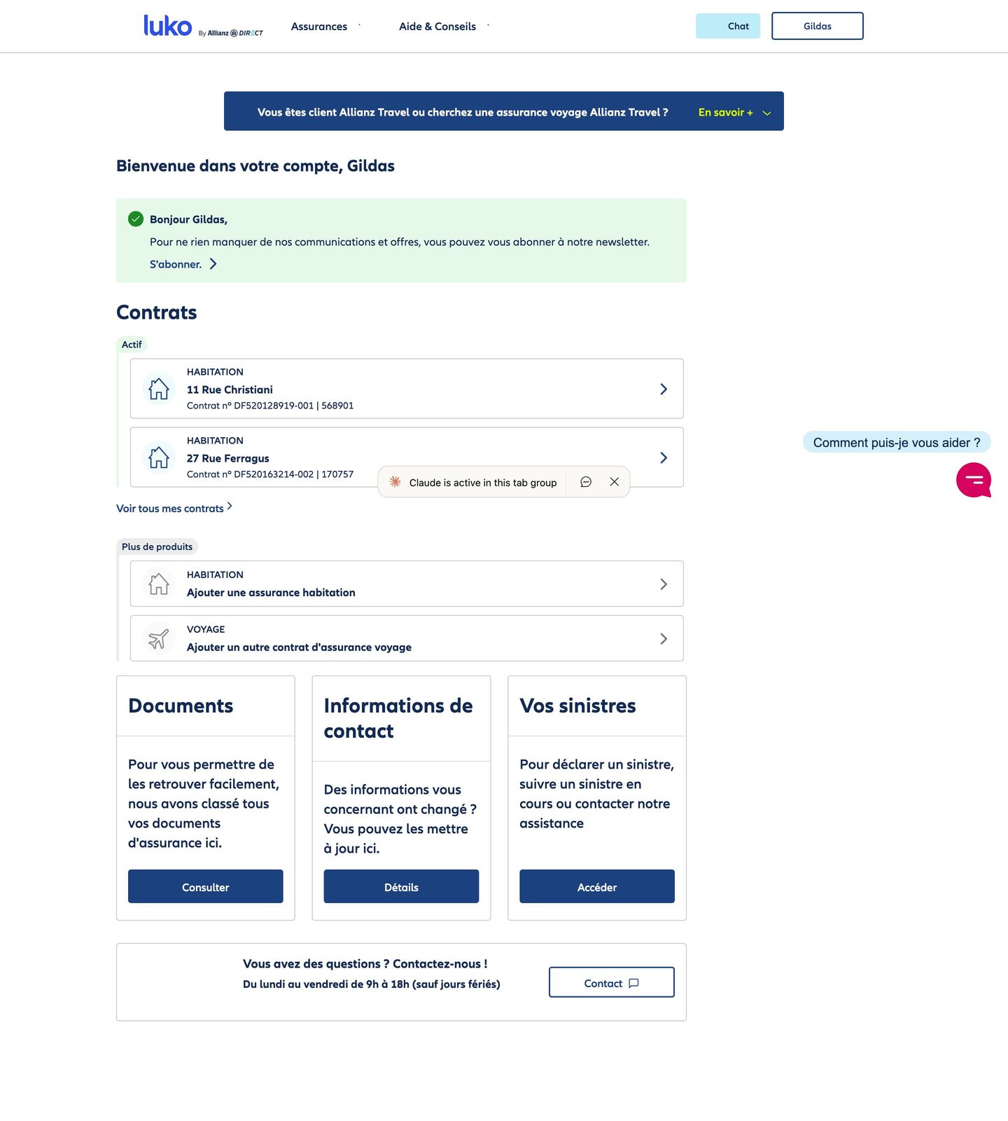
I made three observations. On positioning, the customer area mixed a management tool and an acquisition channel with no hierarchy, selling coming before serving for people who had come to be served. On trust, the chat switched to English when it crashed, near-empty pages loaded slowly and a refresh could return a 503 error with the page in plain text, cookie banner included. On hierarchy, documents lived in three places, the home page blocks read like marketing pages, the newsletter prompt was more visible than the contracts and an Allianz Travel banner followed the user right into the certificate form. The user's model, "I manage my insurance", did not match the architecture, "here are our offers".
The rule and its cost
| What I chose | The credible alternative | |
|---|---|---|
| The bet | A single rule: a policyholder logs in to get a document or to file a claim. The banners and the newsletter prompt go. The cross-selling goal stays whole and changes form: a "Get insured" section that presents the offer as a service, at the same level as the contracts. | Keep the architecture, three tabs and banners, while improving the visuals and the labels. |
| Why | On a customer area, noise is paid for in support calls and in policyholders who give up. An advert aimed at people who came to be served annoys them, whereas exposing the offer is exposing the service: a policyholder who finds out they can cover their trip or their car in the same place gains as much as the insurer. | A reskin does not change the job the area is trying to do, whereas that job was the wrong one. |
| The cost | An unsolicited redesign ignores constraints I do not know: legal display obligations, the insurer's information system, whatever the banners may bring in today. It is reasoning with screens, to be confronted with those constraints before it is a product. |
What I did
- Audit in three observations. Positioning, trust, hierarchy, above.
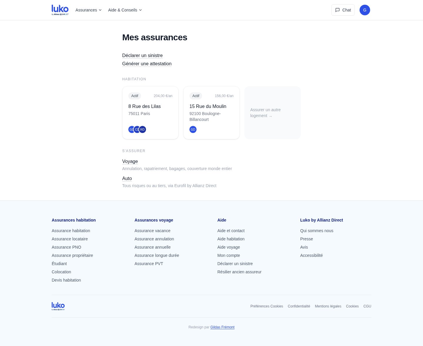
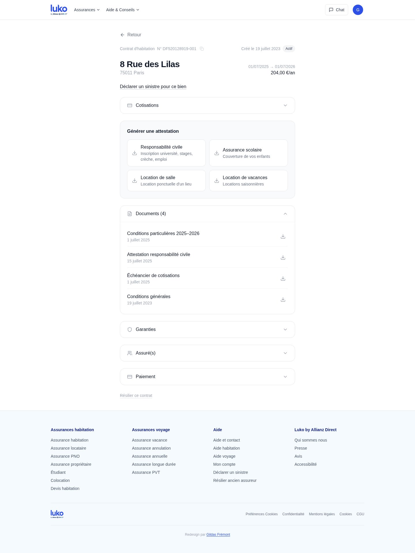
- Iterate three times, one principle each time. Progressive disclosure: the claim starts on the home page by choosing the property, actions appear in the context of each contract. Wording as interface: "add a contract" becomes "get insured", with cross-selling becoming a section of the home page, Travel and Car with what each offer covers, in place of the banners and of a generic button that promised nothing. Proximity: the Documents tab disappears, documents belong to their contract, the profile sits under the avatar and navigation goes from three tabs to none.
- Rebuild both journeys end to end and put the prototype online. The home page, the claim wizard and the certificate journey are clickable at dist-neon-delta-32.vercel.app.
Cross-selling, kept as a feature
The business goal has not moved: a home policyholder is a customer for travel and car insurance. What changed is the form. The banners, which followed the user right into the certificate form, are replaced by a "Get insured" section on the home page, at the same level as the contracts, with two entries, Travel and Car, and for each what it covers. An empty "Insure another home" card closes the list of contracts. Seen from the business, the constraint looks like it fights the experience. Seen with some product experience, it fits right in, because exposing the offer is exposing the service, and a policyholder who finds out they can cover their trip in the same place gains as much as the insurer. That is the whole difference between an advert and a feature.
Filing a claim: from the contract to the problem
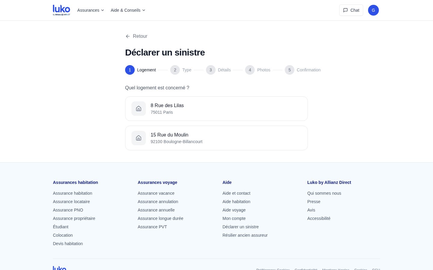
Today, filing a claim means finding the right contract first, then a link buried in its submenus, which presumes the user thinks in contract numbers rather than in the problem they have. The redesign starts from the problem, on the home page, with a five-step wizard, property, type, details, photos, confirmation, that never sends the user back to a contract.
Getting a certificate: from five interactions to three
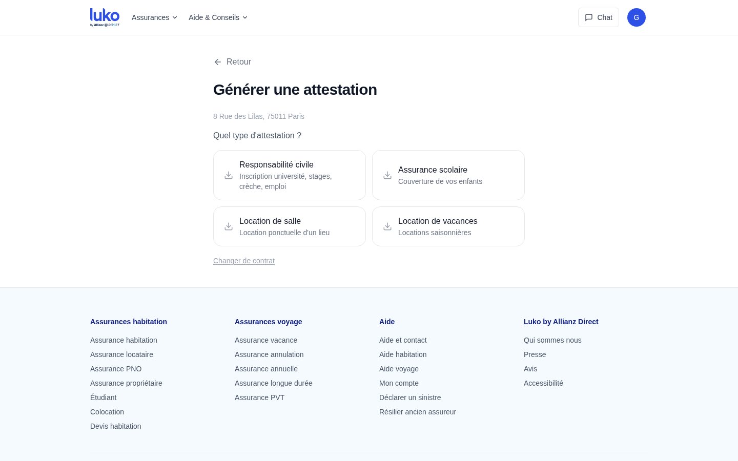
From the home page, the user clicks, picks the contract and sees at once the four certificate types, liability, school, venue rental, holiday rental, with their use case as a subtitle. One click downloads the PDF. The current journey takes five interactions, a scroll and an accordion.
The contract view: everything in one place
Each contract has its page: address, status, dates and yearly price at the top, then the claim for that property, then the certificates for that contract, then its documents with their dates, then the cover, the insured persons and the payment as accordions. The original scatters all of that between the home page, a Documents tab and the contract's subpages. The redesign puts every piece of information in the context that gives it its meaning.
What it shows
A live prototype, with two journeys rebuilt end to end. The business argument is that of any customer area: fewer support calls, fewer policyholders who give up and an offer that sells because it is presented as a service, in place of the banners. The reasoning and the screens are there, the full case is in Case study: Luko redesign with Claude.
What I took from it
The audit, the iterations and the screens were produced with Claude in one short session. It is the rule set before opening the tool that makes the case. Without it, the same tool would have produced a reskin. The reasoning remains the work, the tool only makes it cheap to show. In March 2025, I wrote in Solow's Paradox and AI that we mostly use LLMs to do faster what already exists. This case is no exception: speed made the exercise possible in a few hours, it changed nothing about the reasoning. The other thing I keep is what happened to cross-selling: a business constraint that looks like an enemy of the experience becomes a feature as soon as you treat it as a service to expose rather than an advert to place.
- Tools
- Claude, for the audit, the iterations and the screens.
- Technical expertise
- Information architecture of an insurance customer area, a working prototype.
- Management
- None. A side project.
- Ecosystem
- A former member of the Luko team and the policyholders of an insurer after an acquisition.
Method and references
The principle that guided the removal is the one in Gmail Has Two Things to Teach Us: the quality of an interface is measured by what can no longer be taken away from it, with every element displayed having to carry an intention. The starting point is a post published on LinkedIn, the full case, with the screens, is in Case study: Luko redesign with Claude.
Full cases and articles on gildas.fyi. Happy to walk through any of these on a call.