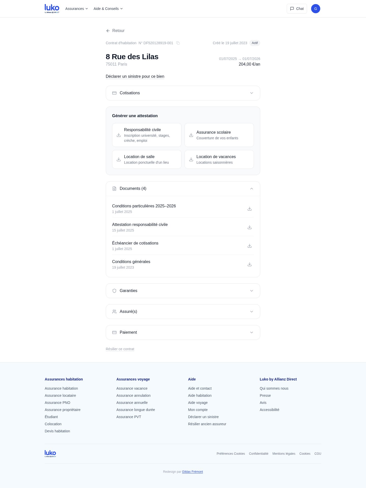
One day I needed a civil liability certificate. I had to open the policy, find the right accordion, work out the certificate types, then generate the document. Unsolicited redesigns were a fashion ten years ago, and rightly criticised: designing without the product's real constraints is too easy. This one is here because it is the only work in this portfolio whose screens belong to me, and because it shows what I do when nobody is paying me.
Three observations
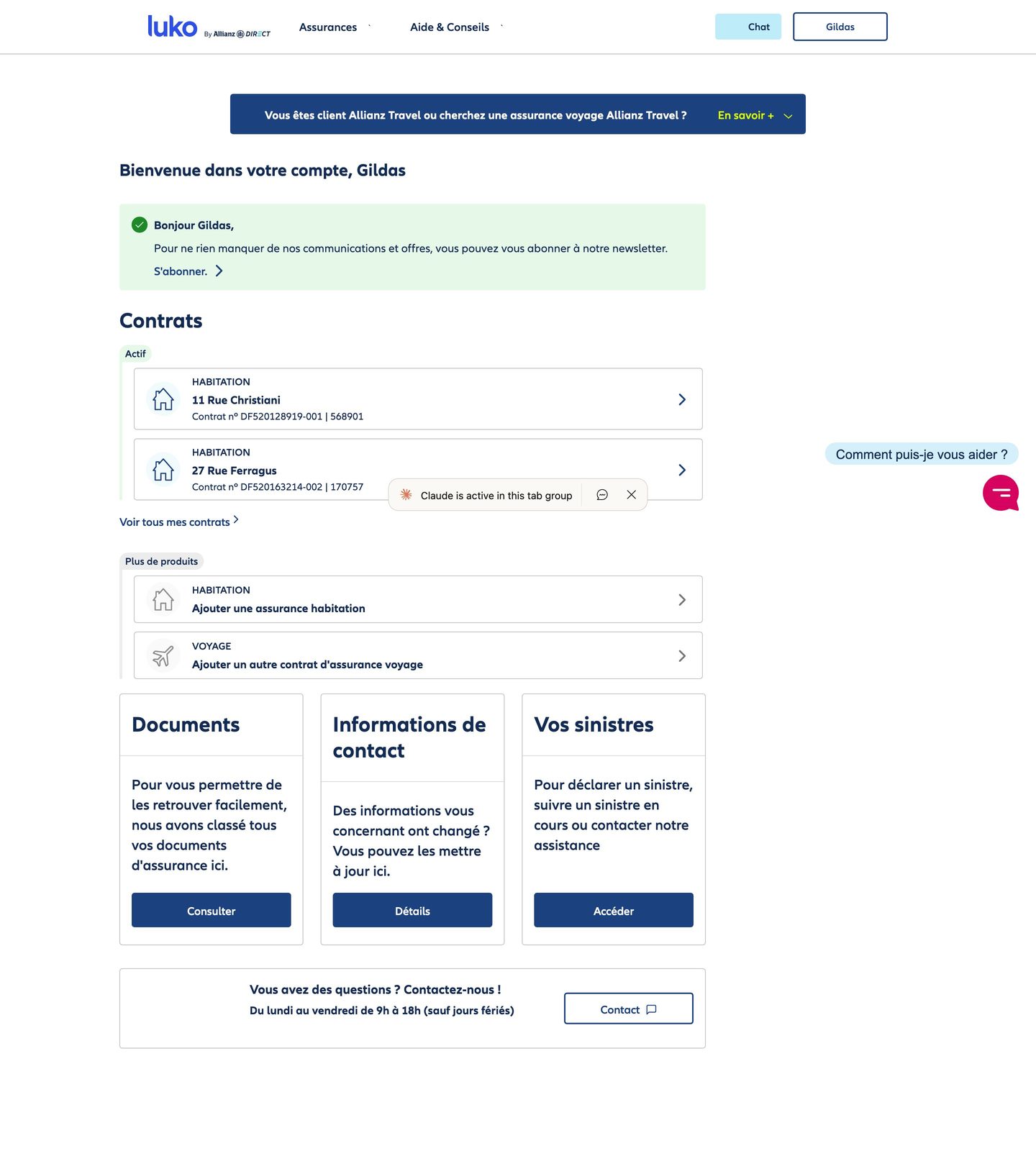
The rule
A policyholder logs in to get a document or report a claim.
Everything that does not serve those two things goes. Except the offer, which stays whole and changes form: a “Get covered” section on the home page, Travel and Car with what each one covers, at the same level as the policies, in place of the banners and an “add a policy” button that promised nothing. Showing the offer is showing the service: a policyholder who finds out he can cover his trip in the same place gains as much as the insurer. That is the difference between an advertisement and a feature.
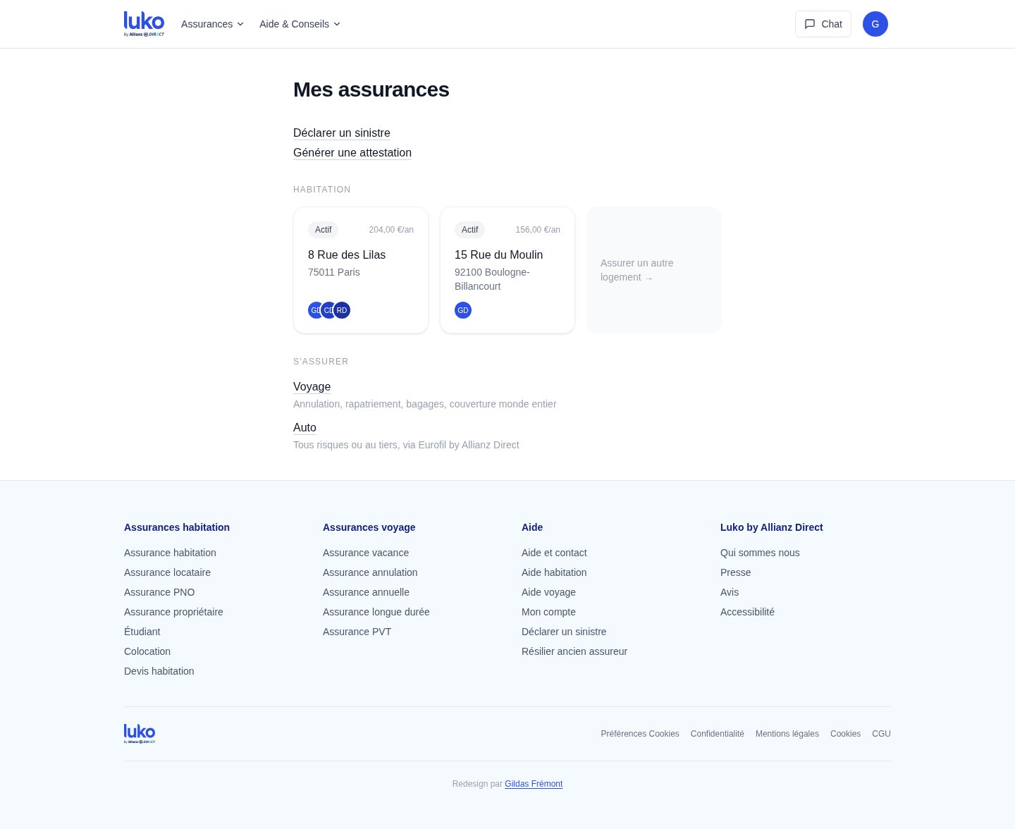
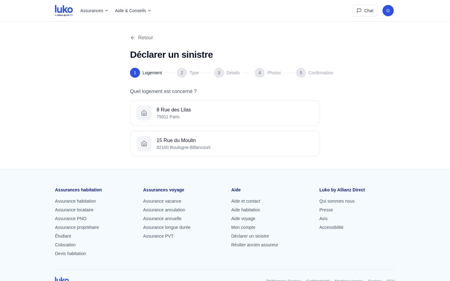
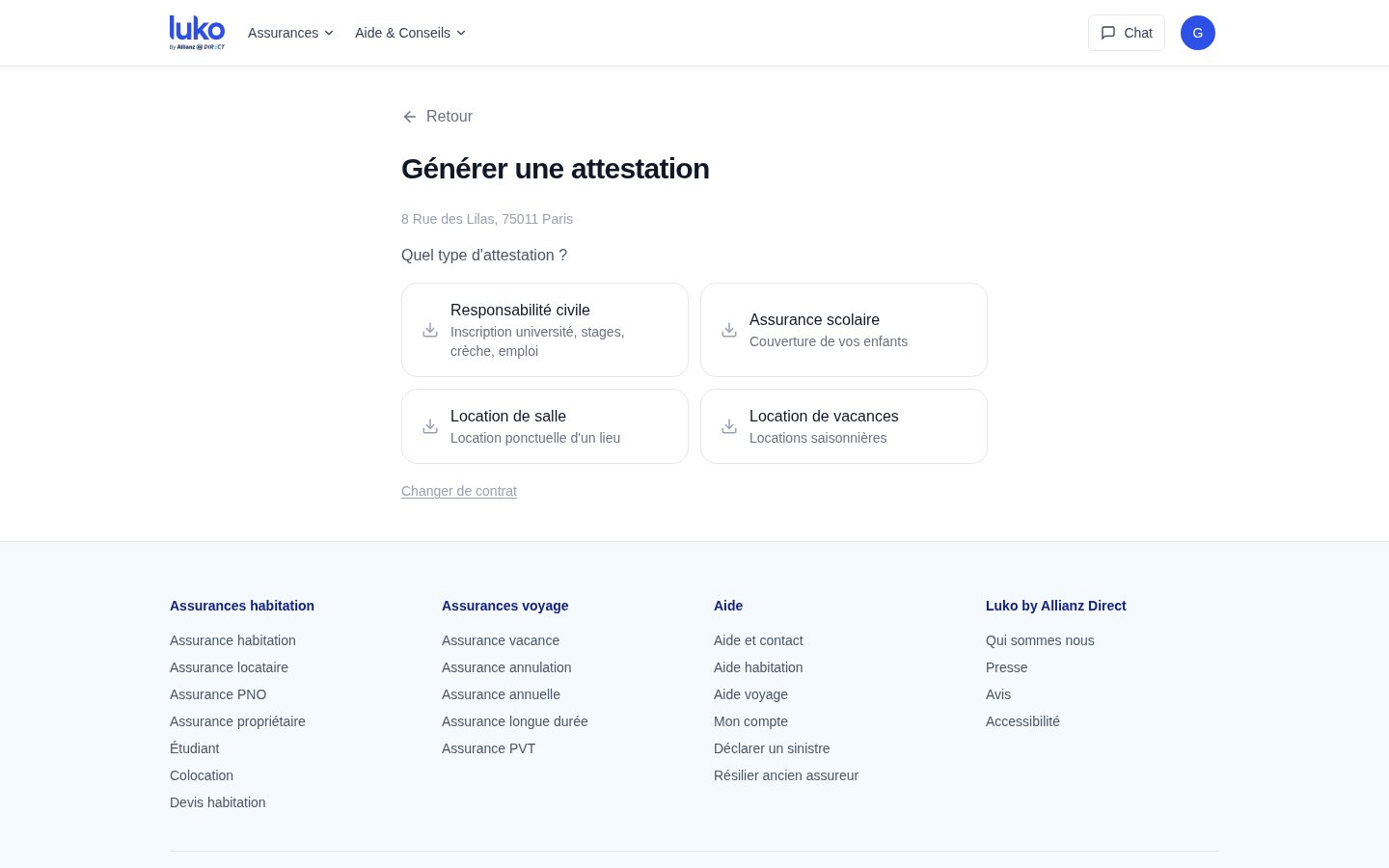
Two journeys, rebuilt end to end
Reporting a claim meant first finding the right policy, then a link buried in its sub-menus: the user is expected to think in policy numbers rather than about the problem he has. The redesign starts from the problem, on the home page.
For the certificate, one click from the home page, the choice of policy, and the four types visible at once, civil liability, school, venue hire, holiday rental, each with its use case. One click downloads.
What it is worth
An unsolicited redesign ignores the constraints I do not know: legal display obligations, the insurer's information system, whatever the banners may bring in. It is a line of reasoning with screens, to be checked against those constraints before it becomes a product. I talked about it with a former member of the Luko team, who confirmed the diagnosis: after the acquisition by Allianz Direct, product decisions had become hard to get built. The audit, the three iterations and the screens were produced with Claude in one short session, from the rule set out beforehand.