Perfection in UI is measured by what can no longer be removed or added. Every superfluous element increases the user's mental load, and with it the risks of confusion, saturation, and error.
In a detail view, we can take the time to absorb complex information, to understand nuanced states. But in a list, every additional state is a cognitive effort multiplied by the number of items to process. This is the type of view where the "binary states" pattern deploys its full strength.
Context is what gives meaning to an interface. It is the cognitive environment, the situation the user understands a priori when using a feature. When you open a task list, you expect to see things to do. When you check your inbox, you look for messages that require your attention. These natural expectations define the normal state of things, the one that does not need to be signaled.
This understanding of context allows us to identify the default state, the one that context makes us understand. The completed task deserves a signal, a simple checkmark that modifies this default state. This economy of means allows our brain to scan both the overall progress and that of the individual elements that compose it.
The strength of binary states does not lie solely in their ability to make one state implicit. Their real power comes from their cognitive simplicity: our brain does not have to classify, just detect the presence or absence of a marker. This simplicity allows stacking multiple binary states without creating confusion.
We detect exceptions faster than rules. By marking only what departs from the ordinary, we create interfaces where important information emerges on its own, without conscious effort from the user.
This economy of means represents the essence of interface design. Yet we often see the opposite: interfaces that attempt to expose all their complexity. Every displayed pixel must carry an intention, a meaning. The challenge is not to reduce pixels, but to increase the ratio between displayed pixels and their signifying power. The most powerful interfaces are those that give the most with less.
The next time you design a list interface, do not ask yourself how to represent all possible item states with status columns, dropdowns that expose the entire workflow, or tables with every attribute.
Ask yourself how to break down your complex states into simple pairs, then which distinct visual signifier you can use for each. Context can sometimes carry the default state -- that is the ideal -- but the essential thing is to maintain this binary simplicity that allows the brain to scan information effortlessly.
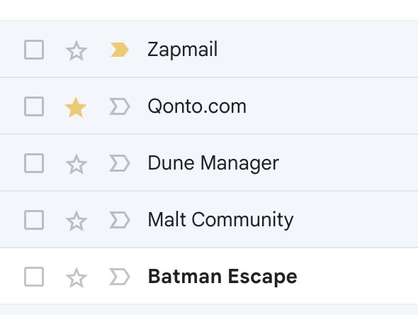
- read/unread: bold/normal + background
- starred/standard: filled star/empty star
- important/normal: yellow chevron/empty
- selected/not: checked box/empty box
The ability to stack these states without creating cognitive confusion:
- Each dimension uses its own distinct visual signifier
- Our brain can scan each dimension independently
- States can be combined (an email can be both unread AND important)
- Visual scanning remains efficient despite the density of information
What you do not see is also what comes from navigation (spam/not spam, archived, etc.), which is a form of presenting a binary state and "factors out" a state without exposing it in the item list.